Using Boks with the Blueprint CSS framework to create Drupal Themes, Part 1
We’re going to create a Drupal 6 theme with the Blueprint CSS grid framework using the Boks visual layout designer. Making a good looking theme in Drupal can be frustrating, especially if you aren’t a graphic or web designer, and you don’t have an HTML/CSS template to work from.
CSS Grid Basics
One shortcut I’ve found for creating great looking web pages is the Blueprint CSS grid framework, which is an open source toolkit that had its version 1.0 release on September 29, 2010. There are several other grid toolkits, such as 960.gs that are similar - each of these helps solve some of the most frustrating CSS layout issues. Blueprint also resets each browser’s CSS back to a common standard, and then builds from there.
The Drupal content management system works extremely well with grid-oriented layout solutions. Many Drupal sites have a similar layout - a header, a footer, a content area, and one or more sidebars on either the left or right sides with the same height as the content area. For those of you who have been doing web development without a CSS framework, just getting that basic layout to work properly (without fixing the height of the content area) can be difficult.
Coming from a software developer background, a basic, fixed grid layout makes a lot of sense, both programmatically and visually. Generally speaking, a grid CSS framework will provide a content area of about 950 pixels wide, which is a common content area on most web sites (for users with 1024x768 monitors).
Laying out the page visually with Boks
If you start with a wireframe (see my post on DIY Wireframing), you can have a pretty good idea of which elements on your web site are going to go where. From a paper wireframe, we can layout our HTML template in Boks, a visual Blueprint CSS designer. Boks is an Adobe AIR application that runs on Macs, Windows, and Linux as a desktop application.
The Boks interface is confusing, but at its heart, it’s a simple tool.
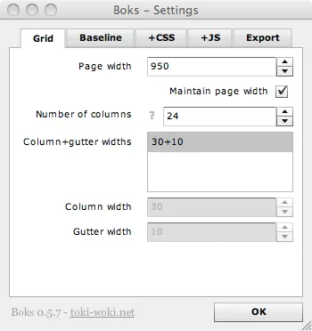
Choose the width (the default, 950, is fine) and the number of columns in your grid (the default, 24, gives you flexibility)
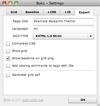
Set the page title, uncompress the CSS (Drupal will do this itself), and turn off the grid on our page
Click OK and hide the Settings dialog box, revealing the main Boks window:
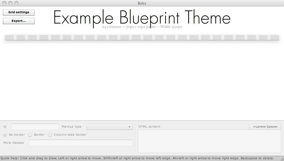
Using Boks the first time can be very confusing. It is not at all clear what you are supposed to do here from the user interface - what you should do is start to add your visual elements. For this example, we are going to create a header, a content area, and a footer with two equal width blocks.
Start from the top, with the header. Click and drag with your mouse across all 24 columns:
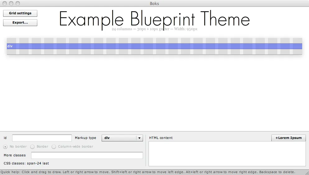
All you need to do now is add a CSS id, in our case “header”, in the id field for the div. You can add other CSS styles or change the markup to another HTML element here, but you don’t have to. We can also add some sample HTML content for our header - put in ”
Example Blueprint Theme
”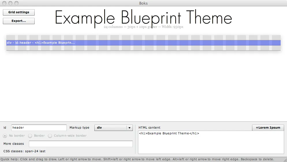
This really doesn’t look like our web page - Boks abstracts the web page into a series of rows and columns. You define the number of columns you want in your web page - we stuck with the default of 24 columns. Each of these columns is 30 pixels wide with a 10 pixel gutter. Our layout elements can span as many of these columns as we want.
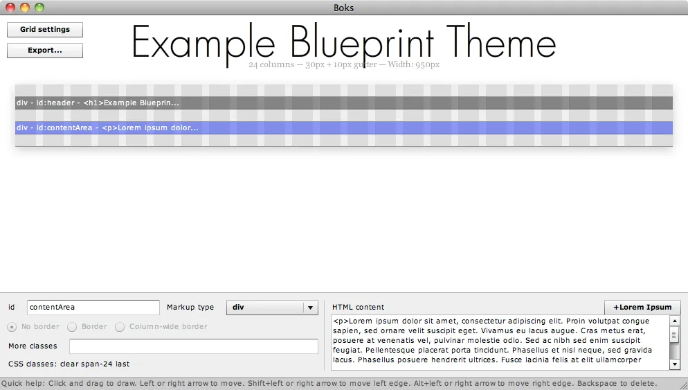
To add a content area, we can drag across all of the columns underneath the header, naming the div “contentArea”. We can also use the dummy text feature of Boks with the “+Lorem Ipsum” button.
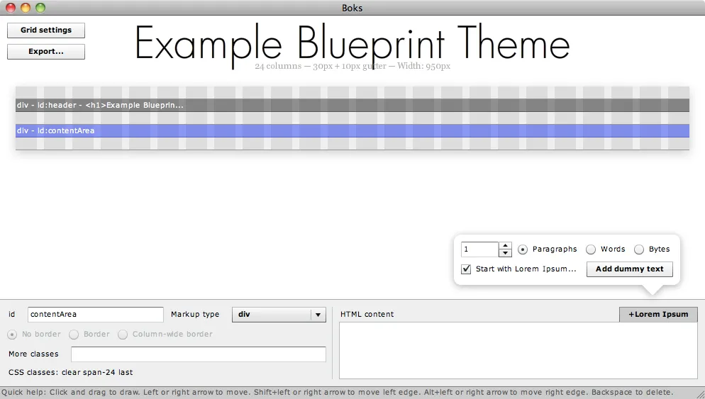
Keep the dummy text defaults and add 1 paragraph of Lorem Ipsum text.
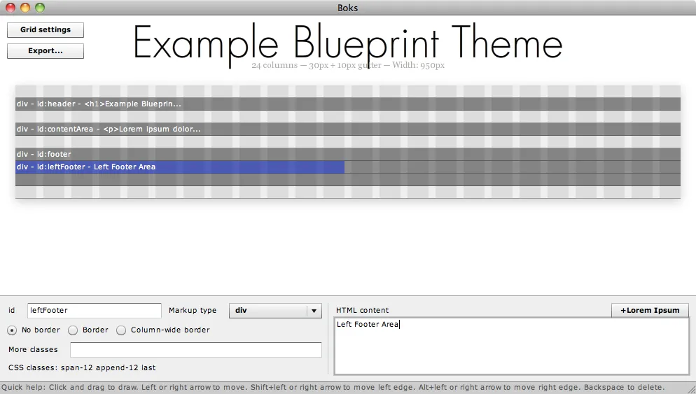
Last, we need to add a footer, the same way we added contentArea. Don’t add content to the footer, because we are going to add two equal width areas to the footer.
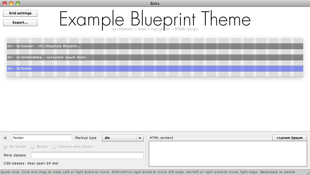
Within each layout element, we can also create additional layout elements that span all or any part of the parent container’s columns. We’re going to add two footer elements, leftFooter and rightFooter. Instead of clicking and dragging below the footer element, we are going to click and drag within the footer element. We’re only going to select half of the columns for each div. Call this div “leftFooter”, and use “Left Footer Area” as the HTML content.
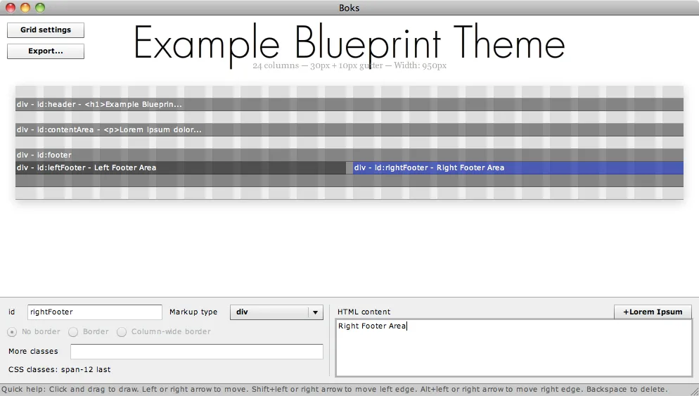
Do something similar with the rightFooter - choose the other 12 columns within the footer element:
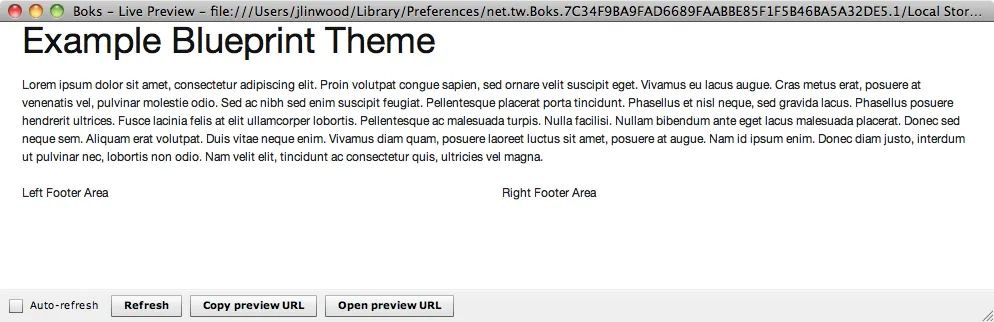
Our web site’s basic layout is done! This is just the first phase, with just layout, and no emphasis on visual styles yet. We can use the Live Preview feature built into Boks to see how our content area looks - Choose Live Preview from the Window Menu and see how your page flows:
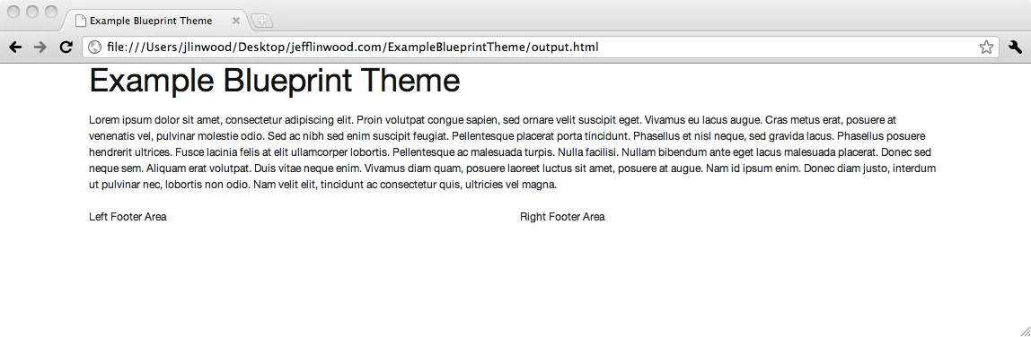
The last steps are to save our project as a .bok file with File->Save. This lets us re-open the project later in Boks. It doesn’t give us the actual HTML we’ll use in our projects, though. For that, we need to Export from Boks. The Export button is in the upper left corner, and it will save our web page in the directory of our choice. Use Firefox, Chrome, Safari or the browser of your choice to open the page up - it will be named output.html.
Here’s the HTML Boks generated for us. With the next part of this series, we’ll explore the CSS classes added to the HTML, and talk about some of the advantages (and disadvantages) of Blueprint CSS.
<!DOCTYPE html PUBLIC "-//W3C//DTD XHTML 1.0 Strict//EN" "http://www.w3.org/TR/xhtml1/DTD/xhtml1-strict.dtd">

<html xmlns="http://www.w3.org/1999/xhtml" xml:lang="en" lang="en">

<head>

  <meta http-equiv="Content-Type" content="text/html; charset=utf-8"/>
  <meta content="Boks - 0.5.7" name="generator"/>

  <title>Example Blueprint Theme</title>

  <!-- Framework CSS -->
  <link rel="stylesheet" href="css/screen.css" type="text/css" media="screen, projection"/>
  <link rel="stylesheet" href="css/print.css" type="text/css" media="print"/>
  <!--\[if lt IE 8\]><link rel="stylesheet" href="css/ie.css" type="text/css" media="screen, projection"/><!\[endif\]-->
</head>

<body>
  <div>
    <div id="header"><h1>Example Blueprint Theme</h1></div>
    <div id="contentArea"><p>Lorem ipsum dolor sit amet, consectetur adipiscing elit. Proin volutpat congue sapien, sed ornare velit suscipit eget. Vivamus eu lacus augue. Cras metus erat, posuere at venenatis vel, pulvinar molestie odio. Sed ac nibh sed enim suscipit feugiat. Pellentesque placerat porta tincidunt. Phasellus et nisl neque, sed gravida lacus. Phasellus posuere hendrerit ultrices. Fusce lacinia felis at elit ullamcorper lobortis. Pellentesque ac malesuada turpis. Nulla facilisi. Nullam bibendum ante eget lacus malesuada placerat. Donec sed neque sem. Aliquam erat volutpat. Duis vitae neque enim. Vivamus diam quam, posuere laoreet luctus sit amet, posuere at augue. Nam id ipsum enim. Donec diam justo, interdum ut pulvinar nec, lobortis non odio. Nam velit elit, tincidunt ac consectetur quis, ultricies vel magna.</p></div>
    <div id="footer">
      <div id="leftFooter">Left Footer Area</div>
      <div id="rightFooter">Right Footer Area</div>
    </div>
  </div>
</body>
</html>